Recipe Book - Part 1
Activity Instructions
This activity will have you create a page for a recipe site. It should be responsive and include good SEO, be accessible, and will give the opportunity to practice using Flexbox.
Estimated Time: 2 hours
01 Review and plan
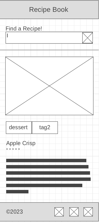
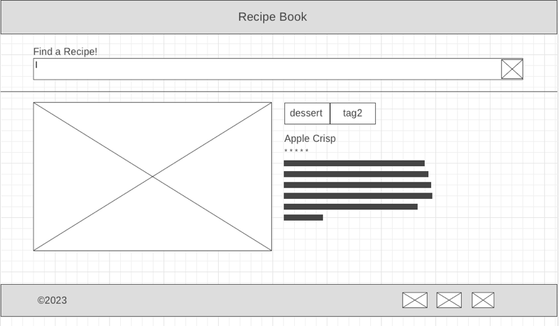
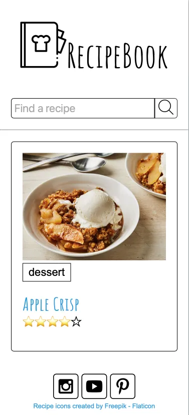
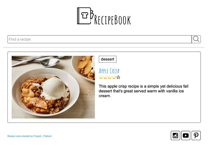
Begin by reviewing the provided wireframes and mockup below to see what the webpage will look like on both small screens and large. You can use the indicated colors and fonts or you can choose some of your own.
Create a new folder to hold this project called recipes. Then create an html file: index.html, two javascript files: recipes.mjs and main.js, and a css file: recipes.css. Add the HTML you need to have a valid new page as well as a link element for your CSS and a script for your Javascript. (Add main.js in the script element)
We also need some images for the recipes. Download the recipe images and add them to your project folder.
One last setup item. We need to copy and paste the contents of this file: recipes.mjs, into the recipes.mjs file you created earlier.
Make sure to add a new link to the site /index.html file as well!
02 Write the HTML
Next add the HTML to display the content. Create the elements that will house the major parts of the page first: header, main, and footer. The header will contain the logo and name of the site. In the images folder that you downloaded earlier you will notice a file called recipe-book.png. Use this in the title.
We are using some icons from a site called Flaticon. We are free to use them, but the license require some attribution in return. This site asks that we add this link <a href="https://www.flaticon.com/free-icons/recipe" title="recipe icons">Recipe icons created by Freepik - Flaticon</a> somewhere on the page. Let's put it in the footer.
Along with the attribution for the recipe book icon, we also need some social media icons. These icons also require attribution. These icons are provided from Iconfinder through an account called AlfredoCreates. The license here is bit more flexible in how we attribute. This time we will do it in a comment. See below for an example:
<div class="social">
	<!-- Social media icons provided under CC from https://www.iconfinder.com/AlfredoCreates  -->
	<a href="#"><img src="images/instagram_icon.svg" alt="instagram icon"></a>
	<a href="#"><img src="images/youtube_icon.svg" alt="youtube icon"></a>
	<a href="#"><img src="images/pinterest_icon.svg" alt="pinterest icon"></a>
</div>
So that attribution link at the bottom of our site is not the most attractive thing. We can minimize the size (And you should. Try 0.6em), so it is less noticiable, but it will still stick out. What if we don't want to attribute? That is easy...be willing to pay to use the resources. All of these sites remove the attribution requirement if you pay :)
Next create the search form as shown in the wireframe and mockup.
Finally, create the recipe section. You can look in the recipes.mjs file for information. Choose any recipe for now. For the ratings section we want to show filled in and empty stars like the mockup shows. We need to make sure that this very visual rating representation is also accessible. We can use aria attributes to do this as seen in the example below.
<span
	class="rating"
	role="img"
	aria-label="Rating: 4 out of 5 stars"
>
	<span aria-hidden="true" class="icon-star">⭐</span>
	<span aria-hidden="true" class="icon-star">⭐</span>
	<span aria-hidden="true" class="icon-star">⭐</span>
	<span aria-hidden="true" class="icon-star-empty">⭐</span>
	<span aria-hidden="true" class="icon-star-empty">☆</span>
</span>
The aria-label will be read by the screen reader, and the aria-hidden="true" on the stars will tell the screen reader to ignore those and they will not be read.
03 Begin styling
In the recipes.css file, begin writing the CSS to make your page match the details in the small screen mockup. Below are a few things to note:
-
You should resize your browser to be narrow, like a mobile screen. You can do this either through the developer tools, or just by changing the width of your browser
-
Start with the global styles.
-
The font used for the headlines is called
Amatic SCand can be found on Google fonts. However if you look closely at the font you should notice that it breaks a couple of our accessibility rules for fonts. Choose another font that you think has a similar feel, but is better for accessibility. -
You can use
Arial, Helvetica,sans-seriffor the rest of the fonts. -
It would be good to add a rule to make our images responsive. We never want an image to be bigger than the space it has available. Something like the following is common:
img { max-width: 100%; } -
You will notice that with everything stacked up on the mobile, we really don't need to do much to get the layout right. You might still use Flexbox though, in column orientation, so we can use the alignment properties as needed.
-
Notice as well that on mobile the recipe description is not shown. When we make it responsive on the next step make sure to show the description on wide screens.
-
There are not a lot of colors in this page, but custom properties are still a good idea to set important style information. Choose a primary and secondary color to use and set them as you see below.
 @import url("https://fonts.googleapis.com/css2?family=family=Amatic+SC&display=swap");
 :root {
 --primary-color: #1B98E0;
 --secondary-color: #59c3c3;
 --text-dark: #333;
 --text-light: #ebebeb;
 --primary-font: Arial, Helvetica,sans-serif;
 --secondary-font: "Amatic SC";
 }
Continue adding CSS until your page matches the small screen mockup above.
04 Make it responsive
At this point your page should look like the narrow mockup above. Now we can add the CSS to make our page responsive to larger screens sizes as well. We will need to use @media queries to check for the increasing size of the window. The queries will make changes at certain sizes (breakpoints as they are often called).
Begin by widening your browser window. Watch what happens to the page. At a certain point you will notice that the layout starts looking a little stretched out. This will probably be around 600px. Let's add the first breakpoint there. Since we are using Flexbox this time around we can simply add a rule to change the flex-direction from column to row.
Next we will keep widening the screen to watch for when the layout starts looking off again. The next point shuold be somewhere around 960px. Wider than this and the page looks too stretched out. Set this as the widest our layout can grow with another media query.
05 Add Social Media Meta information
You should have done some exploration this week about Social Media Meta tags. These meta tags give social media sites the information they need to display a nice summary of our site for easy posting to social media. We should add some tags to our website so people can share our content on their social media platforms. Here's an example of the recommended tags:
<meta property="og:title" content="Page Title">
<meta property="og:type" content="website" />
<meta property="og:description" content="Page Description">
<meta property="og:image" content="URL to an image">
<meta property="og:url" content="URL of the page">
<meta name="twitter:card" content="summary_large_image">
ogstands for Open Graph, a format developed by Facebook that many social media sites understand now. There are a lot of options for properties to include. The list above is considered a good starting point for most sites.
Add those to the head of the document, then change the values to reflect the content of the page. You can see a list of valid types on the open graph website.
You may be wondering what to put in for all those values? Well, you can use the same values you used for the
titleanddescriptionmeta tags on your page for the equivalent og tags. The image should be something that represents your page. In this case a picture of food would probably work. This is the image that will be shown when someone shares your page on social media. Theurlshould be the URL of the page you are on. Thetwitter:cardis a Twitter specific tag that tells Twitter how to display the page when someone shares it. Thesummary_large_imagetells Twitter to use the image you provided as the main image for the page.
06 Check with Lighthouse
Open your page in Chrome, and access the Lighthouse tool. Run it for mobile first. How does it look? Read through the errors and recommendations. Make changes to get the scores as close to 100 as you can! You should be able to get to at least 95-96%.
07 Commit and push to Github
Commit your changes, then push them to GitHub. Wait a few minutes then check to make sure they show on Github pages. If you need a review on how to do this check out github instructions. Start around step 3.
Remember your metadata! This week we have another new addition.
- Meta Charset Attribute
- Title Element
- Viewport Meta Element
- Meta Description Element: Short description of the site
- Meta Author Element
- Favicon link
- Link reference to your CSS file.
- Social Media Meta: New
- Script Element linking to a Javascript file (When using Javascript)
For more information see: MDN: What's in the Head?
After verifying that your page updated, submit the URL to your page in Ilearn. The URL will look something like this: https://githubusername.github.io/wdd131/recipes. Make sure to replace "githubusername" with your actual github username :)