Cool Pics - part 1
Activity Instructions
This activity will have you create a page to act as a photography gallery. The gallery will be responsive, meaning that it will look good on small screens and large
Estimated Time: 2 hours
01 Review the site plan
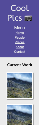
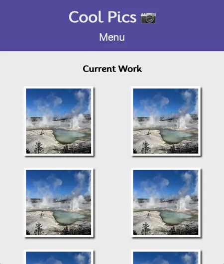
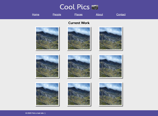
Begin by reviewing the provided mockup below to see what the webpage will look like on both small, medium, and large screens. You can use the indicated colors and fonts or you can choose some of your own.
Create a new folder to hold this project called coolpics. Then create an html file: index.html,a javascript file: coolpics.js and a css file: coolpics.css. Add the HTML you need to have a valid new page as well as a link element for your CSS and a script for your Javascript.
Remember in the Mission Statement assignment when you were asked to add more metadata to the
headof your document? We should add that list to all of our pages moving forward. Here is it again with one new addition:
- Meta Charset Attribute
- Title Element
- Viewport Meta Element: new for this week!
- Meta Description Element: Short description of the site
- Meta Author Element
- Link reference to your CSS file.
- Script Element linking to a Javascript file (When using Javascript)
For more information see: MDN: What's in the Head?
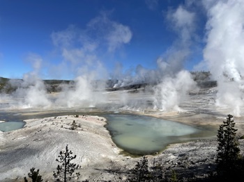
Finally download these two images and add them to the project: norris-sm.jpeg and norris-full.jpeg
Make sure to add a new link to this assignment to the site /index.html file as well! (ie <a href="coolpics/index.html">Coolpics</a>)
02 Write the HTML
Next add the HTML to display the content. Create the elements that will house the major parts of the page first: header, main, and footer. The header will contain the title of the site and navigation. You can copy/paste the following for the title Cool Pics 📷.
In the footer we will provide a simple copyright message: ©2023 Not a real site 😀.
For the main element add the headline as shown on the mockup, then add a section element to contain our gallery. You should put a class="gallery" on that section. We will just use some placeholder images. We will need 9 images, each image should be in it's own figure. An example of how your images can look is below.
<figure>
	<img src="norris-sm.jpeg" alt="picture">
</figure>
03 Begin Styling
In the coolpics.css file begin writing the CSS to make your page match the details in the small screen mockup. Below are a few things to note:
-
You should resize your browser to be narrow...like a mobile screen. You can do this either through the developer tools, or just by changing the width of your browser
-
Start with the global styles. What font should be used for the body copy and headlines? What color(s) should links be? Should the base font size be increased? (yes!) Set the color for the header and footer, etc.
-
If you want to match the fonts in the mockup you can use
Moolifor the headlines (@import url("https://fonts.googleapis.com/css2?family=Mooli&display=swap");), andArial, Helvetica,sans-seriffor the rest. -
It would be good to add a rule to make our images responsive. We never want an image to be bigger than the space it has available. Something like the following is common:
img { max-width: 100%; } -
You can use the provided image
norris-sm.jpegfor the gallery. The design calls for square images, but the provided one is not square! You can set the height and width of the image to be 250px. You will notice that the image becomes distorted however. We don't want this...we would rather have a crop. You can get that by adding the following rule to your CSS for the image:object-fit: cover; -
The "Menu" you see will eventually be used as a button to hide and show the navigation links on mobile. In preparation for that make it a
buttonelement...then you will need to use CSS to make it look not like a button. -
If you want to use your own colors feel free, otherwise continue for the colors used in the mockup.
To specify the fonts and colors which we should use, we can use something called CSS custom properties (CSS variables). These are a great way of keeping track of things like colors, fonts, etc. I think it is far easier to remember something like
--primary-colorthan to remember#52489c@import url("https://fonts.googleapis.com/css2?family=family=Mooli&display=swap"); :root { --primary-color: #52489c; --secondary-color: #59c3c3; --accent-color: #f45b69; --text-dark: #333; --text-light: #ebebeb; --primary-font: Arial, Helvetica,sans-serif; --secondary-font: Mooli, san-serif; }Copy/paste the code above into the top of your CSS file, then to use them in your CSS you would do something like this:
body {
  font-family: var(--primary-font);
  font-size: 1.2em;
}
a:link,
a:visited {
  color: var(--accent-color);
}
Continue adding css until your page matches the small screen mockup above.
04 Make it responsive
At this point your page should look like the narrow mockup above. Now we can add the CSS to make our page responsive to larger screens sizes as well. We will need a @media query or two to check for the increasing size of the window...and will make changes at certain sizes or breakpoints as they are often called.
Begin by widening your browser window. Watch what happens to the page. At a certain point you will notice that the layout starts looking a little stretched out. This will probably be around 700px. Let's add the first breakpoint there. At this point we would not have room still for the menu items to fit horizontally...so the only change we will make is to switch our one image column layout to two columns. Add a media query to make this happen (when adapting to an widening screen we should watch min-width ). Check the solution below if you get stuck.
Emergency use only!
@media screen and (min-width: 700px) {
  .gallery {
    grid-template-columns: 1fr 1fr;
  }
}
*note that this code assumes you used grid earlier to help with alignment. If you didn't use grid for your mobile layout (since we only had one column) you will need to add at least one more line above: display: grid;
Next we will keep widening the screen to watch for when the layout starts looking off again. The next point should be somewhere around 1000px. Now we have room for more columns of images...and we have room for the navigation to switch to horizontal.
Add another media query to make the necessary changes. Make sure to hide the "Menu" button as well! We don't need it on the wide screen. A common way to do that is to set display: none;
05 Commit and push to Github
Commit your changes, then push them to GitHub. Wait a few minutes then check to make sure they show on Github pages. If you need a review on how to do this check out github instructions. Start around step 3.
After verifying that your page updated, submit the URL to your page in Ilearn. The URL will look something like this: https://githubusername.github.io/wdd131/coolpics. Make sure to replace "githubusername" with your actual github username :)