Build a blog
Activity Instructions
This week we will take the design for a simple blog site that you developed in this week's Design a Book Review Site activity and build it with HTML and CSS. We will also then make the page somewhat dynamic by generating some of the markup for the page with Javascript.
Estimated Time: 3 hours
01 Review the Wireframe.
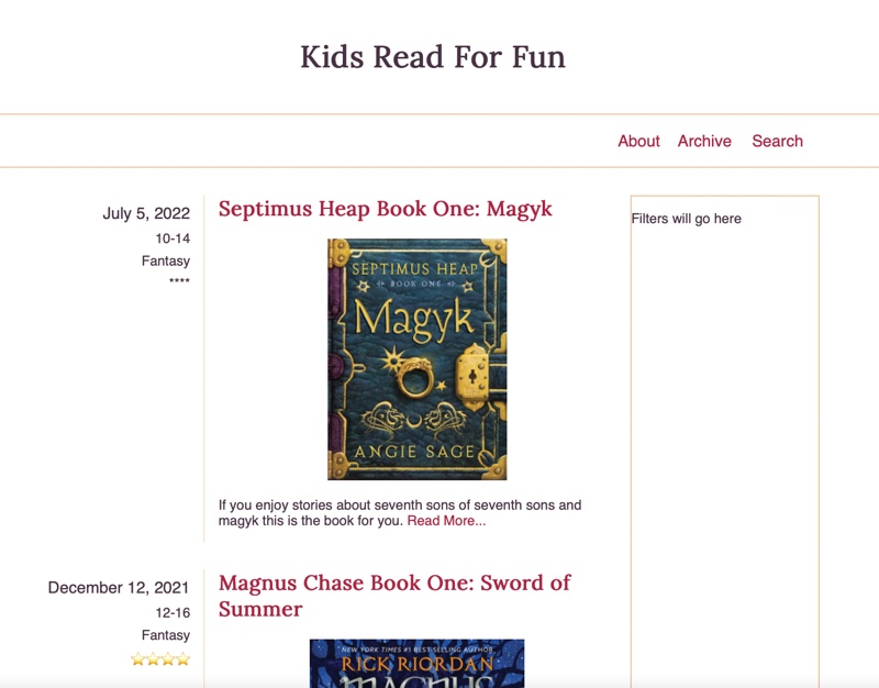
For this activity we will be building a webpage for a book review blog. Below you will find a wireframe, and a mockup that we will use to guide us in this.
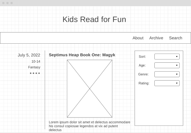
After reviewing the wireframe spend some time thinking about what parts of the layout should be grouped together in HTML, and what tags you might use to do that.
Notice that the Filters portion of the page is not complete in the mockup. We will do that part later.
02 Write the HTML
Add a new directory called blog to your wdd131 directory. Add new index.html and blog.css files inside that new directory. Then open the main index.html for your site (the one at the root of the wdd131 directory) and add a link to this new page (blog/). Finally download this javascript file: blog.js and add it to the blog/ directory with the others. This file contains information you can use as you write the HTML about a couple of books. For the first part of the assignment you will only need to look at the file to get the information to add to your HTML. We will use this file more with Javascript in the second part.
Next write the HTML you will need to display all of the content from the wireframe. Make sure to keep semantics in mind. As well, make sure to use elements to group related parts of the page together.
Also, don't forget to add the recommended items to the
headof your document!
- Meta Charset Attribute
- Title Element
- Viewport Meta Element
- Meta Description Element: Short description of the site
- Meta Author Element
- Link reference to your CSS file.
- Script Element linking to a Javascript file (When using Javascript)
When thinking about semantics, you should think in terms of the parts of the page: lists, paragraphs, headlines, headers, footers, etc. For example the navigation is made up of a list of links right? So it would make sense to use the HTML element that matches (
<li>)
Also keep in mind the accessibility of your page when choosing your elements. For example what should you use for the article date? Visually the date is larger than the surrounding text which makes it stand out. How can we do something similar for a person using a screen reader?
You can skip the filter form for now as we will learn about forms in the next unit. Do leave a space for it though. Leave yourself a note for now, something like <p>Filter form will go here</p>
03 Choose some colors and a Font.
Spend a few minutes thinking about colors and fonts. Pick 2-3 colors you think would work well together. You can use a resource like Coolors to help with this.
Then pick one or two fonts you like from either the web safe font list, or Google Fonts
Start your CSS by writing your general styles. Set the font family for body and headlines, font sizes, colors, link styles, etc.
If you would like to match the colors and fonts in the mockup instead of choosing your own they are listed below:
- Gold color: #EFC69B
- Red color: #AF1B3F
- Dark color: #473144
- Body font: Helvetica, Arial, sans-serif
- Headline font: Lora, Impact, serif (Lora can be found on Google Fonts.)
04 Add the CSS for the layout.
Using the CSS Grid, write the CSS to apply the layout from the wireframe to your page.
There are 3 places where we will need to use simple grids.
- For the navigation in the header
- For the main body of the page to get the articles to appear on the left and the box that will hold the filters on the right.
- Inside of each article to get the details on the left and the title, image, and description on the right.
We will do the first grid for the navigation together, then you can finish the others on your own.
We need a 3 column grid for the navigation. We can use relative units like fr or exact units (px). In this case where we know how long each link will be and thus the amount of space each needs, and because the menu is aligned to the right side of the layout exact units will work better.
To create the grid for the navigation we need to look at the HTML structure we used for the links and identify the Grid Container and the Grid Items. If your HTML looked similar to what is below:
<nav>
	<ul>
		<li><a href="#">About</a></li>
		<li><a href="#">Archive</a></li>
		<li><a href="#">Search</a></li>
	</ul>
</nav>
...what element would be the container and which elements the items? What selector would you use to select the container?
Solution
Container would be the ul, the items would be the li. For a selector you could use something like nav > ul, OR you could add a class directly to the UL and use that class for a selector: <ul class="main-nav">, and then .main-nav as the selector.
You may need to adjust this based on how close your HTML for the navigation is to the code above.
Once you have identified your Grid Container, add the CSS rule to turn on grid for that element and create 3 columns wide enough to fit the text of the links (you may want to refer back to the mockup above)
Your page should look similar to the screenshot below at this point.
We have one more CSS Grid related task for the navigation. The grid needs to be on the right side of the screen instead of the left. This is easy to do with the grid alignment tools. We can use justify-content: end;, and justify-items: end; to re-align it. We will learn more about CSS Grid alignment in a later lesson, but if you want a preview check out those properties in the CSS Tricks Grid Guide for some idea about how they work.
With the first grid as a model you now should add the other two grids to the page. One to take the article details and place them to the left of the article content, and the other to place the articles to the left of the box that will contain our filters. Add the CSS to create those two grids.
You should follow the same process of identifying the Grid Container and Grid Items first. If all of the elements you need to be Grid Items do not share the same parent in the HTML, you may need to change your HTML structure so that they do.
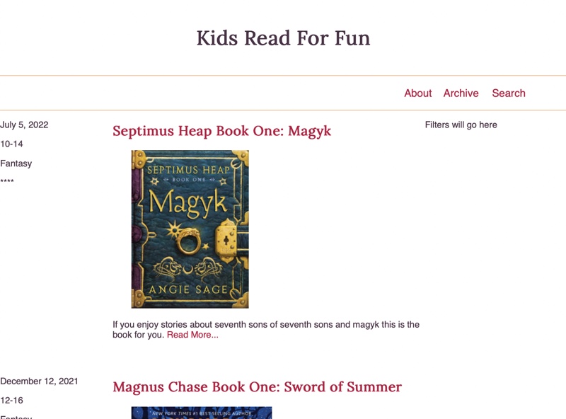
05 Finish styling the header
We got a start on the last step on styling the header, but it still doesn't look like the mockup. We should finish it now. Refer back often to the wireframe and mockup to make sure that you pay attention to the spacing and alignment details.
I find it useful when approaching tasks like this to make a list of steps to solve the problem. A list in this case might look similar to the following:
- Increase the size of the title of the page, center it, and add some padding to match the spacing in the mockup.
- Remove the bullets on the navigation list.
- Add the lines above and below the navigation element. (border)
- In the mockup it appears that the navigation links do not go all the way to the right edge. Try setting a
max-widthand centering the block by settingmargin: 0 auto; - It looks like the font size of the links is larger than the normal font size. Make it so.
- Increase the height of the navbar to match the mockup. (try padding or line-height)
Once you have the header styled (and matching the mockup as closely as you can) you are done for this week. We will finish the styling for the articles next week. Your page should look similar to below. (Your colors and fonts do not have to match the screenshot)
06 Check Accessibility
Take a moment to review the accessibility of the work you have done so far. Run the Lighthouse tool against your page. How did you do? Aim for a score on accessibility of at least 95%.
07 More Accessibility
Often when thinking about Accessibility we can tend to focus only on the visually impaired and forget that there are other disabilities that can interfere with efforts to browse our sites. We also sometimes rely too heavily on tools like Lighthouse. For example, some people are unable to use a mouse to navigate. They often browse entirely through their keyboard. Open up the W3Schools site and then start hitting tab.
If you are on a Mac you should do this in Chrome or Firefox. In Safari this is not enabled by default. You can enable it through
Safari Settings > Advanced > Accessibility.
Imagine that you were trying to get to the "Learn HTML" link in the HTML section. How many times did you have to hit tab to get there? This is a definite problem, and yet Lighthouse didn't flag it for us. Unfortunately it can't check everything ☹️
Try again with the WebAim site. Notice that after your first tab a hidden link pops up...skip to main content. If you hit enter while focusing that link it will bypass the rest of the navigation. We should add something similar to our blog.
In the header of the page add a link:
<div class="skiptocontent">
  <a href="#maincontent">skip to main content</a>
</div>
Also add an id to the main element of maincontent. Next add the CSS necessary to hide the link from the viewer until the link is focused.
A common way to do this is to use
position:absoluteto slide it off the screen...you could try something liketop:-40px;.
Then we can take advantage of the :focus pseudo-class. To set thetop:0when the element is focused.
See below if you get stuck.
Solution
.skiptocontent a {
	/* set the element to absolute positioning */
	/* move it off screen */
	/* Make sure it will be on the left edge of the screen */
	/* Change the background and color to something that stands out */
}
.skiptocontent a:focus {
	/* Move it back on when focused */
}
08 Finish styling the articles.
The main part of the page that we have yet to style is the article. We began last week by adding a grid to accomplish some of the layout.
Review once again the mockup below then make a list of steps that you can see need to be done to make our page match the mockup. Once you have created your list compare it to the one below.
Article List of steps
- The size of the font for the date of the article should be increased
- The list of details on the left should all be right aligned.
- The space between the lines of the list of details on the left should be slightly reduced.
- Add a right border to the container holding the list of details and add spacing on the left and right of that to match the mockup.
- Adjust the top margin of the title of the post so that it lines up vertically with the date on the left.
- Center the image of the bookcover.
- Add some space in between the two articles- Since we restricted the width on the navbar last week (review that CSS rule if you need to) we should do the same to the
mainelement as well so that it matches and we end up with nice alignment.
How did you do? Did you notice all of the details?
Using the list above as a guide, write the CSS to style the articles.
09 Add some Javascript
If this were a real blog site it would be nice if we didn't have to change the index page each time we added a new post. Many sites operate in this way. In order to do this we need to dynamically generate the HTML markup for the articles instead of having it be hard coded in the HTML file.
Earlier you were instructed to download a blog.js file and add it to the blog/ directory. That file contains a variable called articles that contains an array of information about articles. We can use that array to build out the HTML markup we need to dynamically build the list of articles on our page.
On a real site the articles data would be pulled stored in a database and requested as needed. In order to keep ours simple we will just store it in a variable locally.
To proceed, connect your new JS file to the index.html file in that directory by adding a script element. Don't forget to defer!
Just like we did above with the CSS, it would be good to come up with a list of steps to follow in order to solve our problem.
- Get a reference to the element we want to insert our articles into. You may need to add a class or ID to the element your articles are currently in to do this. (document.querySelector)
- For each article in our list:
- Create a new
articleelement. If you have any classes on your hard coded articles in your index.html, add those to your new element in Javascript. - Create a template literal string and store it in a variable. The contents of this string should be a copy/paste of the contents of one of your current
articlesfrom the HTML file. - Everywhere in the copy/pasted HTML where there is information specific to this post we should replace it with the data from the current article. (${item.date})
- Set the
innerHTMLof the new article to the template literal string we just built.
- Create a new
- Append the new article to the output element so it will show on the page.
Create one or more functions that will be responsible to build and output the HTML necessary to display the list of articles.
The
articlesvariable you were given is an array of objects. We will learn more next week about creating objects, but we have already been using them without knowing. For example thedocumentwe reference when we do something likedocument.querySelector()is an object that hasproperties, andmethods(functions) that belong to it. when we want to reference a certain part of the object we use the dot operator.So if we wanted to use the title of the first object in our
variablesarray we would writearticles[0].title. We can use a loop such as theArray.forEachloop we studied this week to make it easy to access each object in the array one at a time no matter how many items there are in the array.
10 Cleanup/Add a new post.
Once you have the Javascript working and it is adding the articles dynamically you might notice that you have two copies of each article on your page. Go into the index.html file and remove the HTML that displays the articles. We don't need it anymore.
For fun let's see how easy it would be to add an new article. In the blog.js file, look at the articles variable. Copy the following JS object with information about another book into the array that contains information about our books. Paste it below the last item in the array (don't forget to add a comma).
{
id: 3,
title: "Belgariad Book One: Pawn of Prophecy",
date: "Feb 12, 2022",
description:
"A fierce dispute among the Gods and the theft of a powerful Orb leaves the World divided into five kingdoms. Young Garion, with his "Aunt Pol" and an elderly man calling himself Wolf --a father and daughter granted near-immortality by one of the Gods -- set out on a complex mission.",
imgSrc:
"https://images-na.ssl-images-amazon.com/images/I/41ZxXA+nInL.jpg",
imgAlt: "Book cover for Pawn of Prophecy",
ages: "12-16",
genre: "Fantasy",
stars: "⭐⭐⭐⭐⭐"
}
The final array would look something like below:
const articles = [
{
id: 1,
title: "Septimus Heap Book One: Magyk",
date: "July 5, 2022",
description:
"If you enjoy stories about seventh sons of seventh sons and magyk this is the book for you.",
imgSrc: "https://upload.wikimedia.org/wikipedia/en/5/5f/Magkycover2.jpg",
imgAlt: "Book cover for Septimus Heap 1",
ages: "10-14",
genre: "Fantasy",
stars: "****"
},
{
id: 2,
title: "Magnus Chase Book One: Sword of Summer",
date: "December 12, 2021",
description:
"The anticipated new novel by Rick Riordan. After Greek mythology (Percy Jackson), Greek/Roman (Heroes of Olympus), and Egyptian (Kane Chronicles), Rick decides to try his hand with Norse Mythology, and the end result is good.",
imgSrc:
"https://books.google.com/books/content/images/frontcover/xWuyBAAAQBAJ?fife=w300",
imgAlt: "Book cover for Magnus Chase 1",
ages: "12-16",
genre: "Fantasy",
stars: "⭐⭐⭐⭐"
},
{
id: 3,
title: "Belgariad Book One: Pawn of Prophecy",
date: "Feb 12, 2022",
description:
"A fierce dispute among the Gods and the theft of a powerful Orb leaves the World divided into five kingdoms. Young Garion, with his "Aunt Pol" and an elderly man calling himself Wolf --a father and daughter granted near-immortality by one of the Gods -- set out on a complex mission.",
imgSrc:
"https://images-na.ssl-images-amazon.com/images/I/41ZxXA+nInL.jpg",
imgAlt: "Book cover for Pawn of Prophecy",
ages: "12-16",
genre: "Fantasy",
stars: "⭐⭐⭐⭐⭐"
}
];
Save the file and look at your page. You should now have three articles listed!
11 Commit and push your work.
Commit your changes, then push them to GitHub. Wait a few minutes then check to make sure they show on Github pages. If you need a review on how to do this check out github instructions. Start around step 3.
After verifying that your page updated, submit the URL to your page in Ilearn. The URL will look something like this: https://githubusername.github.io/wdd131/blog. Make sure to replace "githubusername" with your actual github username :)